
I like the lighting of this images as it highlights the instrument, the use of brass instruments is also generic to the ska genre.

I like the black and white used in this photo, it makes the image very strong, as the man stongly stands out in the images, this could be an idea for possibably considered if I took photographs of band members for my print productions. I also like his comical/ theatrical pose.

The black and white used again in this image strengthens the image, black and white is also generic to the ska genre. This image of three ska fans skanking is again generic as too is their clothing, I think the compostion of this images is very good two as it focuses well on three fans amongst a crowd.


I like the font used in this gig poster, it's large and the chuncky font makes it impactual, it stands out to it proposed audience, ska fans.


Gwen Stafani, 'No Doubt. The angle and compostion of this photograph is great, it fully captures the artist, as both a performer and role model to fans. The black white again makes it a strong image, and the lighting used creates some good shadows.

I like the idea of maybe incorpriating a hand into my print production, linking it to the theme of our bands song which is money grabbing. I was thinking of drawing a had possibably creating a design which could then be developed in 'Photoshop'.


I like the use of four different poses/ images of marilyn are used her to create a quad of images, it's very eyecatching, and arranging in this kind of way could be very affective on my digipack
Ska gig posters


Ska vinyl sleeves and album covers
 A reggae / ska compliations vinyl. I like the strong vibrant colours of the artwork and they illistrated style of the girl.
This cover features illistrated versions of the band members. I think this cover works well because it is fun, appeals to ska fans and carrys generic images of ska. This kind of illistration coupled with the font used reminds me of a comic strip.

This covers features the Tojan logo. The font used looks quite retro, vintage as if taken fans back to the roots of ska/ reggae. This cover is simple and works well, I like the small colour detail at the bottom - colours of the Jamican flag, it stands out effectively. A fan buying this ablum would be fimilar with the Trojan lable.
 N.Y. Beat! Ska/ reggae compliation vinyl
 The Toasters - Beat up
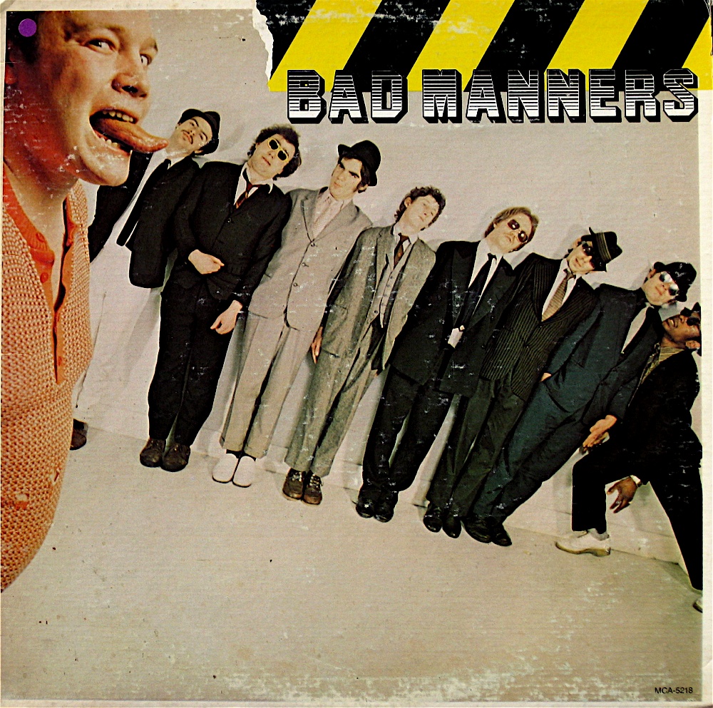

Bad Manners
I like how the images on this cover look like they have been cut out, like a collage. There are several layers of images to used to build up this affect. I like the background image of the band members lined up in their suits, it looks fun, and appeals to ska fans. The font used is a generic font used by the band, bold font using capital characters.
The Beat - Mirror In The Bathroom
I like how on this cover photographic images of the bands heads have been put on cartoon bodies. The cover is black and white, generic of the ska genre, the green hightlights details, such as the band members ties, and also the font. The font used by The Beat is very anglier fitting with the 'rocksteady' image.

1960's posters/ music art

Reggae art


Israelites - Desmond Decker
I like the retro patterns used on the album art, it has a 60's feel about it. The posterised image in the middle kind of reminds me of pop art. The shapes used are also quite tribal.
I like the retro patterns used on the album art, it has a 60's feel about it. The posterised image in the middle kind of reminds me of pop art. The shapes used are also quite tribal.
Political art/ propeganda & protest graphics


Protest poster created by 38Degrees, a protest organisation. The poster depicks Geogre Osbourne as The Artful Dodger. The poster clevely uses a picture of said person and comicially makes him look the The Artful Dodger.
An excellent range of cover art, particularly retro images from the 50's which are currently very popular in high street retail and design outlets. Note the dancer in your 2nd image is Fred Astair who was an iconic dancer in 1930's and 40's musical films. The names of the artists in your example could be included in order to add confidence to your research.
ReplyDelete"A pint and a fight"...an interesting representation of Britishness!!! Also an example of a culture which can't handle alcohol!
It would be useful to discuss cultural aspects of your examples; the artists in your band are white though the cultural roots of the genre are featured in the black and white aspects of costume. Great research thus far.
Music Video:
ReplyDeletePlanning of music video is mainly proficient though there is a confusion between research and planning. Strongest element is research into costume and locations, to include camera angles. Some lovely clips from the Marx Brothers and "Blackpool" plus iconic ska videos. Linking this research more closely to production would have strengthened; also storyboards not posted.
Print Productions:
Planning of print productions reflects continuing commitment to the promotional package. References to similar generic cover are excellent whilst evolution of idea is interesting and creative.