Wednesday 26 January 2011

Digipak planning


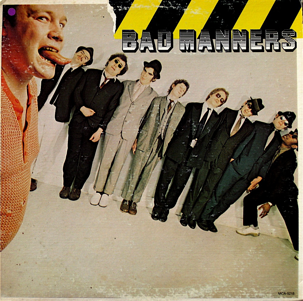
 I'm thinking of having 8 panels for my digipack a similar sort of style to this digipak for A Beatles album :
4 panels will face inside when the digipak is opened and four on the outside.


I've started to sketch some ideas of what I would like to have on the panels of my digipak,  I've designed the front panel incorpiating my own font. My font was inspired by that used by 'The Beat'.

Digipak ideas (simple bullet points)
Diagram style images of a ska fan (could be comical)
Images of braces, trilby and boots.
Back panel - track listing over photo
Lyrics?
Montage of ska images
Images from music video


Photo's I've taken I could use in my print productions.


Photo's I've edited.


Before
After  Here I adjusted the threshold of the image to create this stencil effect, then I filled in the background in green, yellow and red, the colours of the Jamacian flag, which are significant to reggae and ska. 
Front panel ideas

 Original idea sketch
After scanning in my sketch I did some editing work in 'ms Paint', just initially filling in the font.


I then did some further editing in Photoshop, I added one of the others I edited of the boots. I choose to add the boots because I think it is a strong image, and is a generic signisfier of the genre.


Here I added another shoe image, a photo I took of someone standing on a record. I like the image and the two sets of the shoes representing the 'rude boy and Rude girl'.


'Rude boy and Rude girl' I was talking about above. The pointed shoes for the female fan, and boots for the male.


Digipak photoshoot

I took some photo's for my print productions, using Issy as a model, dressing her up in the generic ska costume (braces, sunglasses, trilby). I had an idea for the track listing of my digipak to write the songs names on pieces of paper then stick them to my model, I tried this and think I looks quite effective. Sitting in my models room I saw that she has some string and pegs attacthed from from side of the room to the other, this inspired me to take my idea and pin up the track names. I think having developed this idea it is very effective and visually interesting way of displaying the track listing, and the back panal of my digipak, it is also quite quirky and fun which is again generic of the genre.

 Initial idea, sticking track listing to wall
My model Issy wearing generic ska clothing (Tribly, braces, badges)


Idea development :Pinning the tracks names to the washing line, I think this makes for a very visually nteresting way of displaying the track names, and could work well once edited as the back panal to my digipak.
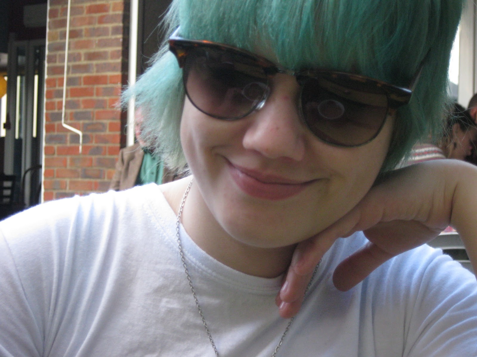
Side view of ska fan, I thought about including this image on one of the inside panals of my digipak, and editing is so, so it looks like a diagram, 'The typical ska fan' this could be a fun and quirky way of appealing to ska fans, and establishing a generic connection.
Close up of badges on braces- generic costume for ska fans.
Track listings on my model, again I think this a visually intesting way of desplaying the track names. It always is very appealing to ska fans though the models dress in generic ska clothing. I think this idea also adds a quirky element to the digipak, which again quirkiness and fun is generic of the ska genre. 
Image of records, generic.

Edited photo's


Saturday 1 January 2011

Digipack (print production) inspiration

I have collected some images that have inspired me for my own print productions, these images have inspired with there fonts, colours, compostion, generic ska images, (use of) etc.

I like the lighting of this images as it highlights the instrument, the use of brass instruments is also generic to the ska genre.
 I like the black and white used in this photo, it makes the image very strong, as the man stongly stands out in the images, this could be an idea for possibably considered if I took photographs of band members for my print productions. I also like his comical/ theatrical pose.
 The black and white used again in this image strengthens the image, black and white is also generic to the ska genre. This image of three ska fans skanking is again generic as too is their clothing, I think the compostion of this images is very good two as it focuses well on three fans amongst a crowd.
 What has become an iconic image of ska and the band 'Madness'

 I like the font used in this gig poster, it's large and the chuncky font makes it impactual, it stands out to it proposed audience, ska fans.

Gwen Stafani, 'No Doubt. The angle and compostion of this photograph is great, it fully captures the artist, as both a performer and role model to fans. The black white again makes it a strong image, and the lighting used creates some good shadows.
I like the idea of maybe incorpriating a hand into my print production, linking it to the theme of our bands song which is money grabbing. I was thinking of drawing a had possibably creating a design which could then be developed in 'Photoshop'.
 I love the colours and font used in this vinyl cover, the font looks very retro and the capital characters make the words stand out. I also like the slim line text. I think it would be intresting to experiment with taken some inspiration from old ska/reggae vinyl covers and incorpriating elements of them into my designs.
 It could be intresting on the inside panals of the digipack to have an image like this in the style of a diagram, and maybe with the definition of rudeboy, rudegirl underneath.


 Maybe incorpriate some images I have already taken into my ideas/ digipack
 I like the compostion of this photo, it fits in all the band members well, I think a fish eye lense has been used to take the image.
 Another old image of ska fans, it could be intresting to include some archive images (drawn) on the panals of the digipack.
 Generic image of ska, rudeboy and rudegirl, black and white, checkered.

 It could be intresting to recreate this image but include the bands name on a lable.The c.ds are genreic of the genre, and this could prove an innovative way of approaching my digipack.
 Another iconic ska image/ slogan/ badge.
 Ska compilation album 'Ska Mania' was released in 2009, and the album coversd incorpriates generic image of checkers, and heavy font. The cover is fairly simple but clearly shows its ska roots/ influences, and would appeal to a ska fan.
 I like this image because it's quite fun, the illistrative style also appealed to me, I would like to include some illistrated work into my design.

 Generic ska image - brass instrument - saxophone with checkered detail, and rudeboy decal.
 Another vinyl cover, incorpriating the black and white checks. I really love the illistration of the cover, it's comical and very ska! Thid has defiantly influenced me on the kind on illistrations I could incorpriate in my digipack designs.


 I like the illistration used in this album cover, it's generic to the genre, fun and appealing to ska fans.
 I love the retro look of this album cover from 'Tokyo Ska Paradise' the font and geremetic shapes remind me very much of 1930's-50's print productions.


 I like the use of four different poses/ images of marilyn are used her to create a quad of images, it's very eyecatching, and arranging in this kind of way could be very affective on my digipack

Ska gig posters
Ska vinyl sleeves and album covers

A reggae / ska compliations vinyl. I like the strong vibrant colours of the artwork and they illistrated style of the girl.
The Toasters
This cover features illistrated versions of the band members. I think this cover works well because it is fun, appeals to ska fans and carrys generic images of ska. This kind of illistration coupled with the font used reminds me of a comic strip.
Trojan Ska Rarites box set
This covers features the Tojan logo. The font used looks quite retro, vintage as if taken fans back to the roots of ska/ reggae. This cover is simple and works well, I like the small colour detail at the bottom - colours of the Jamican flag, it stands out effectively. A fan buying this ablum would be fimilar with the Trojan lable.
N.Y. Beat! Ska/ reggae compliation vinyl
I like the comical illistrations used on this cover, the font used is very comic book style.
The Toasters - Beat up
Simple clear bold font, which stands out and is impactual. Another illistration based cover, I like the checkered trousers! This would defiantly appeal to ska fans, and is very much generic of the genre, fun and quirky.
Bad Manners
I like how the images on this cover look like they have been cut out, like a collage. There are several layers of images to used to build up this affect. I like the background image of the band members lined up in their suits, it looks fun, and appeals to ska fans. The font used is a generic font used by the band, bold font using capital characters.


The Beat - Mirror In The Bathroom
I like how on this cover photographic images of the bands heads have been put on cartoon bodies. The cover is black and white, generic of the ska genre, the green hightlights details, such as the band members ties, and also the font. The font used by The Beat is very anglier fitting with the 'rocksteady' image.


1960's posters/ music art

I like the compostion of this piece of poster artwork, the font is layed out well on the poster, and looks good grouped together, this way it draws attention to the text, the bold, slim text is also very eyecatching itself.


Reggae art


Israelites - Desmond Decker
I like the retro patterns used on the album art, it has a 60's feel about it. The posterised image in the middle kind of reminds me of pop art. The shapes used are also quite tribal.


Political art/ propeganda & protest graphics


Protest poster created by 38Degrees, a protest organisation. The poster depicks Geogre Osbourne as The Artful Dodger. The poster clevely uses a picture of said person and comicially makes him look the The Artful Dodger.