
I decided to use the images I used on the pront panel of my digipak on my ad because it is itself a strong image, and I really love it. I put the black square behind the photo to make it look like a polaroid image. There are polaroid images hanging in the background of the photo, I though this was quite quirky, fun and reflect a social aspect of youths and music, having fun. By using the images from the front of my digipak It would also reference to the e.p, and it being an ad for the e.p the target audience would see the image and think of the digipak and vise versa. I included a review on the ad, which I found from my research was on most ads. By using a review it promotes the e.p, and makes it more appealing to the target audience. The checkered board running across the bottom the ad is generic of the genre, and so too is the 'rude boy' behind the title of the e.p, 'money grabber'.
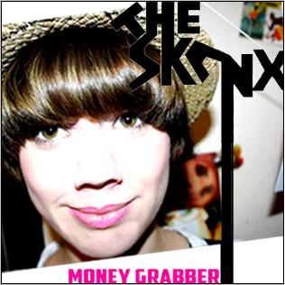 Front panel
This is my final front panel.The font I created was inspired by the generic font used in ska print productions. I made the font myself and was influced by the typography of the band 'The Beat'. The font is anglia and zany, reflective of the genre, with also some reflection of punk influence. The photograph I used for my digipak is a photo of the lead singer (actor) by using a photo of the lead singer it's promotes the band, and is appealing to the target audience. She is wearing generic ska costume - trilby, braces, this is again appealing to the target audience, and genric of the genere. The model is looking directly at the camera, looking staright at the target audience, which would be very eyecatching to a potential buyer. I edited the photo in photoshop, to brighten the image, and make it really stand out, eyecatching. I also enhanced the colours of the photo, to make it more visually appealing. I did the 'money grabber' in pink, because it stands out and compliments the colour palet of the rest of the print production. This pink theme runs though the digipak.
 Back Panel
The back panel also features the lead singer. The e.p tracks are on post it notes on her t-shirt, I thought this was fun, quirky and creative way of displaying the track names. Again the costume is generic - trilby, braces, badges anf thus appealing to the target audience and reflective of the genre. I think the image is very strong, the models eyes are looking directly at the camera, drawing the target audiences attention. I called the record label 'Madhouse records' partly random, but influenced by the combonation of the band 'Madness' and on of their tracks 'Our House'.

The inside panel features various images of the band, thus promoting the band. All the band members are wearing generic ska clothes - trilbys, braces, badges, polo shirts, sunglasses, all appealing to the target audience. I edited the photos to black and white, this is a generic image of ska, along with the black and white checker. To carry on the pink element running though my digipak I filled in some shapes of the graffiti in pink and Jack's tie. I think by running this pink thoughout the digipak it makes each panel stand out, people's eyes are drawn to the neon pink. The pink could also be said to delve into 70's punk influences.
Revisions
 Back panel
I've added the website and copyright info to the back of the c.d after looking at over examples of digipaks most of them had this info so I decided to add it to.
 Under cd panel
 Ad
Ad


