For our advanced portfolio production we had to create a music video and print productions for an unsigned British band.

 Our music video includes and refers to many elements that are typical of the genre. We demonstrated Goodwin’s theory of music videos by creatively demonstrating genre characteristics. When planning and shooting the video we conducted a lot of research in to the genre to make sure that the msuic video offered visual pleasing and interesting to our target audience of ska fans. Our music video uses the generic conventions of ska such as the costume worn by the preformers in our video. There is an abundance of trilby’s, braces boots and badges, the use of the costume uses and reinforces the genre, as well as strongly appealing to fans through the use of fashion, emphasing the tribal fashion of ska fans who will identify with the preformers. The costume we used in the video was particularly inspired by the fashion on ‘Madness’; the black suits and trilby’s. ‘Madness’ style takes elements of formal wear which is a ironic refernece to bankers who are held in contempt whilst also referencing the Jamacian roots of ska.
 The costume worn in the film ‘This is England’ also influenced us greatly creating our costumes The film is based around a group of youths in the peak of 2nd wave ska, jeans, doc martins and skin heads were an integral part of skinhead identity and made a statement about their attitudes. Our consiuos decession to creatively appeal to audiences meant they we took inspirations from different texts, creating a sense of collective identity; this refers to Kress (1998) theory of the sense of belonging audiences have.

The external locations of our music video are urban, which where particularly inspired by ‘This is England’, music videos by ‘Madness’ and the feature film ‘Essex boys’. The urban locations used in ‘This is England’ particularly appealed to us because, the film is set in an era where ska and reggae was centre amongst the youths of the time, particularly influences dress and attitudes of young people, and it was an expression of 1980's disaffected working class youth.

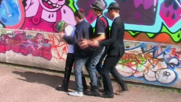 Several shots in the music video feature a bright wall of graffiti as a background, by using this as a backdrop we felt this would make the shot stand out, and become eye catching, as well as relating to the genre, providing aesthetic pleasure. Graffiti also developes the implication of inner city youth rebellion. Our music video is centred on a theme of slapstick comedy was particularly influenced by the quirky style of ‘Madness’, their style is fun and frantic, and their music videos reflect this in a creative and engaging way. For example in the opening of the video we included the iconic ‘Madness walk’ and any ska fan would recognis. By making this reference it appeals to fans to 'Madness'. We also took some time looking through iconic ‘slap stick’ comedians such as ‘Norman Wisdom’, and ‘laurel and Hardy’. We had great fun playing around with these ideas and incorporating them into our video, we felt particularly ‘Norman Wisdoms’ work could bring a very British appeal to our video, and again fit with our quirkily fun influence from ‘Madness’.
 We have developed relationship between other real media texts to create a product which would appealing to our target audiences, engaging them though are use of costume, location, and references to other texts.
 Our representation of youth is strongly drawn from that of in ‘This is England’ youths strongly use their fashion to distinctively show where they belong which tribal group they conform to. Their fashion is strongly influenced by their music taste, taken elements from the music, its roots, and then developing that into something they use to represents themselves. The era of 2nd wave ska came at an area of particularly unrest, Thatcher was in power, and the cold war dominated newspaper covers. The country was in a position of unrest, and I think youths used the music to get back at those in power. The image of ska is often related to that of skinheads, not all skinheads where racists, but there has become a negative association with the images. ‘This is England’ particularly explores the era of the ‘skinhead’, the 1980’s saw the rise of unemployment and immigrations, and with that the rise of anger amongst the working class people of Great Britain, battling to keep Britain for Britain, thus came the rise of the BNP.
 'Skindhead' culture
'Norman Wisdom'
Clip from Norman Wisdom's 'The Early Bird'
This is England Trailer
'This is England - One of the gang'
In this clip we see 'Shaun' become one of the gang, Woody and his gang shave shauns head, and dress him up in braces a shirt and turned and jeans, and becomes on of the gang. By conforming to the dress worn by the other members of the group Shaun is accepted, and acknowledged in their 'tribe'.
Print productions


The font I used for the logo for the band name was inspired by the font used by ska band 'The Beat'. I initially sketched the font out on paper, scanned it onto 'Photoshop' and edited it to the final image I used. The bold chuncky typography is generic of the ska genre, and ska bands like 'Madness' and 'Bad Manners' adopt a similar typography style.The front panel of my digipak features the lead singer of the band, having reseached other ska band digipaks most included images of the band on them, either photographs or cartoons. The performer is wearing a trilby hat which is generic of the ska genre. The 'boyish' hair cut is a cultural reference to 'skin girls', a group of female skinheads, popular in the 2nd wave ska era.
The back panel of my digipak features the logo in shocking pink, references the punk roots and youth rebellion culture of the 70's and 80's, and pink also links back to the graffiti in the music video and the inner city urban locations. The torso shot of the performer on the back panel shows that she is wearing braces and pin badges, generic connotations of the ska fashion, as well as having fashion roots in punk and mod styles.
Young ska fan wearing braces and pin badges, generic of the ska genre.
Question 2 : How effective is the combination of your main product with ancillary texts?
 When reseaching and planning my products and refer texts to plan a production that was unique and developed the genre. For example the comical quirky antics of the performers was inspired by the style of 'Madness' and British comedians, like Norman Wisdom, whose slapstick humour has a distinctively Britsh feel. buy watching clips on Youtube I could gain inspiration from these clips for my own work. The costume worn by the performers in our music video is typicial of the ska genre, we experimented with the costume taken inspiration from different ska artists, from the suited ironic dress of Madness to the 1990's third wave ska style of No Doubt. The female lead singers style in our music video is very much influenced by that of 'Gwen Stifani' the female lead singer in 'No Doubt'. Our music video is centred around the performers, and establishes the performers as part of the ska youth culture, though there costume, and locations of the music video. Several shots in our music video feature a bright wall of graffiti in the background, making the shot visually appealing and generic of the urban locations of ska influnced products, for example 'This is England'. I took elements of the bright graffiti and the connations of the rebellion of the inner city graffiti artist / youth culture into my print productions.

 This is the back panel of my digipak. I designed my own font / logo for the band. My design was inspired by the anarchy style of 'The Sex Pistols' and the genre blocked typography used by ska bands such as 'The Beat'. I decided to have the logo in shocking pink as it is visually pleasing, and links back to the colourful graffiti in our music video. The performer on the back panel is the female lead singer in the music video. Having a member of the band of the digipak promotes and markets the band. I edited the photo's to black white, as this is generic of the ska genre, I then highlighted elements of the graffiti with the same shocking pink colour of the band logo, making the images visually appealing and creating a identity across the digipak. The checkered boarder reflects the checkered guitar strap in the music video and the checkered trousers worn by the lead singer.

Magazine advert
Question 4: How did you use media technologies in the construction and research, planning and evaluation stages?
Research
When reseaching the genre for my music video, I used Youtube to look at clips of other ska music videos and vintage footage of 1950's reggae dancehalls. Youtube allowed me watch and gain acess to thousands of music videos and clips that allowed me to research around the genre of our chosen and and gain inspiration from other performers work. For example the quirky antics and fun theme of our music video was inspired by watching 'Madness' music videos, like 'House of fun', we enjoyed Madness's style so much that we included the iconic 'Madness walk' in our video. Using clips on Youtube meant I could review the clips, then embed them on my blog and analyse them, meaning that I could understand other performers work meanign that I could apply a greater depth of knowledge of the genre and music videos in my production.
When planning my production I also used 'Google images' to look at generic ska images, as well as looking at costume worn by ska fans / performers. The speed and ease of the search engine meant I could research an image as soon as an idea came into my head, and bring up lots of relating images, I could then embed these into my blog and develope my thought accordingly.
Print productions
When researching for my digipak I spent some time looking at other digipaks and adverts made by other ska bands, and looking at generic aspects of there print design, for example the font, colours and images used, for example I found a number of ska bands (notibably 2 tone and 2nd wave ska) used cartoon images on their dgipaks. I used 'Google Images' to find pictures of other ska bands digipaks I could then embed these images into my work and analyse them, using them as part of my creative development.

'Google images' - 1000's of quick image responses for 'ska'
'Madness - One Step Beyond' - One of the videos that inspired our production
Planning
 When planning my music video, I used a digital camera to capture my ideas visually, taking them from paper to something that was a visually realisation. My taken images digitally I could quickly and easily review my photographs and analyse my ideas, experimenting with compostion, camera angles, location and costume. Taken photographs meant I could really develope my work, experiementing with different ideas, and developing them so that my production was as visually appealing for the audience. For example when planning the costume for our performers, I took lots of photographs of the performers in different costumes, then analysed them on my blog, meaning that I could critque my work as I went along, which I think really helped me created a well thought out creative production. I uploaded the photographs I took onto my blog where I then analysed them, and showed my ideas and processes, linking my work to clips and photographs of other performers work. I also used a video camera to take mock footage of initial ideas we had for the music video, by reviewing these clips we could then evaluate our work in progress and make decisions about what worked well, and the best camera angles, and loacations for our production. When editing our production the 'Premere Elements' software meant we could cut down are footage with ease, and add effects. We used the effect 'cross fade' several times in our production, by using the 'cross fade' it meant we could overlap two or more shots, by overlaping shots they made are footage more visually appealing to the audience.
 Still from our production of two shots cross faded.
Print productions
When planning my print productions I took stills using a digital camera of images I could potentially use in my digipak. I arranged a day with one of the performers to take some photographs, which eventually I ended up using for the front and back panel. Taken photographs allowed me to experiement with my ideas visually and develope my work so it was as visually appealing as possible. I used 'Photoshop' to edit my photo's once I had uploaded them onto the computar, by using photoshop I could brighten my images and change the constrast making them stronger and more visually appealing. I could also add my font I designed and checkers into my digipak. Using 'Photoshop' meant I could inhance my photographs, to make them really stand out and look professional.
 Photos from the planning of our production - experimentation with costume and locations.

Evaluation
When constructing my evaluation I used 'Youtube' and 'Google' to embed clips and images into my written work to back up my points and portray my idea visually. I embedded stills from our production onto my blog and then evaluated the stills relating back to my productions.

Print productions

The font I used for the logo for the band name was inspired by the font used by ska band 'The Beat'. I initially sketched the font out on paper, scanned it onto 'Photoshop' and edited it to the final image I used. The bold chuncky typography is generic of the ska genre, and ska bands like 'Madness' and 'Bad Manners' adopt a similar typography style.The front panel of my digipak features the lead singer of the band, having reseached other ska band digipaks most included images of the band on them, either photographs or cartoons. The performer is wearing a trilby hat which is generic of the ska genre. The 'boyish' hair cut is a cultural reference to 'skin girls', a group of female skinheads, popular in the 2nd wave ska era.
The back panel of my digipak features the logo in shocking pink, references the punk roots and youth rebellion culture of the 70's and 80's, and pink also links back to the graffiti in the music video and the inner city urban locations. The torso shot of the performer on the back panel shows that she is wearing braces and pin badges, generic connotations of the ska fashion, as well as having fashion roots in punk and mod styles.
Young ska fan wearing braces and pin badges, generic of the ska genre.
Question 2 : How effective is the combination of your main product with ancillary texts?


 This is the back panel of my digipak. I designed my own font / logo for the band. My design was inspired by the anarchy style of 'The Sex Pistols' and the genre blocked typography used by ska bands such as 'The Beat'. I decided to have the logo in shocking pink as it is visually pleasing, and links back to the colourful graffiti in our music video. The performer on the back panel is the female lead singer in the music video. Having a member of the band of the digipak promotes and markets the band. I edited the photo's to black white, as this is generic of the ska genre, I then highlighted elements of the graffiti with the same shocking pink colour of the band logo, making the images visually appealing and creating a identity across the digipak. The checkered boarder reflects the checkered guitar strap in the music video and the checkered trousers worn by the lead singer.
Our music video shows establishes a strong relationship between the band members, as they perform and mess around togther, much like Woody's gang in 'This is England'. Showing them to be a kind of similar 'gang' or tribe, who are connected through their taste in music and clothing. The inside panel of my digipak feature images of the band, by using these images they promote the band, but also appeal to their audience, establishing a certain set of ideologies and aspirations which their fans will share, for example their clothing. The background of the photos features the graffiti used in our music video, linking the print productions to the music video.
Stills of the graffiti that features in our music video.

'Madness' walk we made reference to in our video, quircky antics of the performers inspired by 'Madness'.
Front Panel
The front panel of my digipak features the female lead singer of the band. I decided feature the lead singer of the band on my digipak as it promotes the image of the band as well as developing the genre as most ska bands tend to be male dominated. The performer is wearing a tribly hat which is a generic connatation of the ska genre, and the performers wear them in the video. The close up of the performers face is eye catching and the diagonal positioning of the image connoates energy and movement, this fits with the quirky theme of our music video. The logo I created for the band appears on the 1st 2nd and 4th panel, carrying a synergy across the print productions, the logo is also a reconisable logo for the band, a marketing aid, fans will reconise the logo.
Inside panel
 Panel 3
The image for my 3rd panel (which features under the cd) is of a model I took wearing some boots, the boots are genric of the ska fashion and some of the performers in our music video weat them. I used a tool on 'Photoshop' to 'posterize' the image to make it look like a graffiti stencil, relating back to our music video which features graffiti, and the urban locations we used. I added the checkered sock detail on 'photoshop', the checkers connote the ska genre and link to the 2nd panel which features a checkered boarder as well as the checkered guitar strap in the music video.

Back panel

Stills of the graffiti that features in our music video.

'Madness' walk we made reference to in our video, quircky antics of the performers inspired by 'Madness'.
Front PanelThe front panel of my digipak features the female lead singer of the band. I decided feature the lead singer of the band on my digipak as it promotes the image of the band as well as developing the genre as most ska bands tend to be male dominated. The performer is wearing a tribly hat which is a generic connatation of the ska genre, and the performers wear them in the video. The close up of the performers face is eye catching and the diagonal positioning of the image connoates energy and movement, this fits with the quirky theme of our music video. The logo I created for the band appears on the 1st 2nd and 4th panel, carrying a synergy across the print productions, the logo is also a reconisable logo for the band, a marketing aid, fans will reconise the logo.
Inside panel Panel 3
The image for my 3rd panel (which features under the cd) is of a model I took wearing some boots, the boots are genric of the ska fashion and some of the performers in our music video weat them. I used a tool on 'Photoshop' to 'posterize' the image to make it look like a graffiti stencil, relating back to our music video which features graffiti, and the urban locations we used. I added the checkered sock detail on 'photoshop', the checkers connote the ska genre and link to the 2nd panel which features a checkered boarder as well as the checkered guitar strap in the music video.

Back panel

Magazine advert
My magazine advert featurs the image on the front panel of my digipak, promoting the digipak, and allowing the readers to reconise and relate the image to the digipak and band. The title of the E.P is in bold shocking pink font at the top of the ad, the shocking pink linking to the other panels of my digipak and the graffiri in the music video. The title of the E.P is at the top as the readers eye naturally reads down, so they read 'moneygrabber, debut E.P, The Skanx, then the release date and reviews, they gather the information easily. The checkers featured on the ad links to the other panels and the checkered featured in the music video (performers trousers, guitar strap).
Q3 - What have you learned from your audience feedback?
We conducted our audience research using questionnaires. They where filled out by a mixed gender class of existing AS media students (of ages 16-17). I also posted our video on Facebook and Tumblr, social networking sites. The opinion of the viewers showed that they we used the generic conventions of the genre well, as the feedback showed that the audience enjoyed the 'urban locations' and 'ska costume'. The audience seem to have enjoyed the video from the feedback, with 4/5 viewers saying they would 'watch the rest of the video' One particualar area the audiences enjoyed where the locations, one viewers saying 'they locations worked really well with the ska genre, I loved the graffiti'.
Question 4: How did you use media technologies in the construction and research, planning and evaluation stages?
Research
When reseaching the genre for my music video, I used Youtube to look at clips of other ska music videos and vintage footage of 1950's reggae dancehalls. Youtube allowed me watch and gain acess to thousands of music videos and clips that allowed me to research around the genre of our chosen and and gain inspiration from other performers work. For example the quirky antics and fun theme of our music video was inspired by watching 'Madness' music videos, like 'House of fun', we enjoyed Madness's style so much that we included the iconic 'Madness walk' in our video. Using clips on Youtube meant I could review the clips, then embed them on my blog and analyse them, meaning that I could understand other performers work meanign that I could apply a greater depth of knowledge of the genre and music videos in my production.
When planning my production I also used 'Google images' to look at generic ska images, as well as looking at costume worn by ska fans / performers. The speed and ease of the search engine meant I could research an image as soon as an idea came into my head, and bring up lots of relating images, I could then embed these into my blog and develope my thought accordingly.
Print productions
When researching for my digipak I spent some time looking at other digipaks and adverts made by other ska bands, and looking at generic aspects of there print design, for example the font, colours and images used, for example I found a number of ska bands (notibably 2 tone and 2nd wave ska) used cartoon images on their dgipaks. I used 'Google Images' to find pictures of other ska bands digipaks I could then embed these images into my work and analyse them, using them as part of my creative development.

'Google images' - 1000's of quick image responses for 'ska'
'Madness - One Step Beyond' - One of the videos that inspired our production
Planning
 When planning my music video, I used a digital camera to capture my ideas visually, taking them from paper to something that was a visually realisation. My taken images digitally I could quickly and easily review my photographs and analyse my ideas, experimenting with compostion, camera angles, location and costume. Taken photographs meant I could really develope my work, experiementing with different ideas, and developing them so that my production was as visually appealing for the audience. For example when planning the costume for our performers, I took lots of photographs of the performers in different costumes, then analysed them on my blog, meaning that I could critque my work as I went along, which I think really helped me created a well thought out creative production. I uploaded the photographs I took onto my blog where I then analysed them, and showed my ideas and processes, linking my work to clips and photographs of other performers work. I also used a video camera to take mock footage of initial ideas we had for the music video, by reviewing these clips we could then evaluate our work in progress and make decisions about what worked well, and the best camera angles, and loacations for our production. When editing our production the 'Premere Elements' software meant we could cut down are footage with ease, and add effects. We used the effect 'cross fade' several times in our production, by using the 'cross fade' it meant we could overlap two or more shots, by overlaping shots they made are footage more visually appealing to the audience.
Print productions
When planning my print productions I took stills using a digital camera of images I could potentially use in my digipak. I arranged a day with one of the performers to take some photographs, which eventually I ended up using for the front and back panel. Taken photographs allowed me to experiement with my ideas visually and develope my work so it was as visually appealing as possible. I used 'Photoshop' to edit my photo's once I had uploaded them onto the computar, by using photoshop I could brighten my images and change the constrast making them stronger and more visually appealing. I could also add my font I designed and checkers into my digipak. Using 'Photoshop' meant I could inhance my photographs, to make them really stand out and look professional.


Evaluation
When constructing my evaluation I used 'Youtube' and 'Google' to embed clips and images into my written work to back up my points and portray my idea visually. I embedded stills from our production onto my blog and then evaluated the stills relating back to my productions.

Lizzie question 3 needs to be much more developed. You need to evaluate feedback on your music video and print productions in detail and endeavour to note any gender differences in responses. Also you need to explain your focus group and any comments made by other students during the edit, or comments you may have had on youtube. I'll give you 3 days to sort this out because you were ill. Email me immediately if there is a problem.
ReplyDelete