Showing posts with label G324 Completed productions. Show all posts

Thursday, 31 March 2011

Analysis of stills

We used a close up shot of the reflection of the lead singer of the band getting ready in a mirror for the opening of our music video. This shot appeals to the target fan base though the use of costume, the band member becomes a mirror image of the audience/ fan, creating a notion on collective identity / tribal dress. The use of mirrors is also voyueristic, this relates to Goodwin's theory of music videos.
The bright graffiti background in these shots reflect the rebellion of youth culture in inner city urban locations, it reflects a sense of rebellion youth culture. The inner city urban locations we used in our music video are generic to the ska genre, having taken influnced from the film 'This is England' and 'Madness' music video's, we included urban loctions in our music video. Again the audience realate to the visuals though the use of generic symbols and images.
In many of the music videos I had looked at instruments where a important part to ska music videos, notibably brass instruments. One particular music video that caught my eye, and influenced this shot was '...' by 'The Mighty Mighty Bosstones'. In the video they use low angles of the performers, which make them stand out, the shots are powerful and visually pleasing.
We included shots of urban locations in and around Norwich in our music video to connote the genre. In this still from our music video music posters can be seen promoting reggae and ska gigs. The music posters appeal to the audiences music taste and the way the audience engage in music.
Close up of drumming shot. Instruments and performers are a large part of the narrative of our music video. From our research we found that instruments and performance occured in a large number of ska music videos, as ska bands tend to be quite large this is important to them.
We used several cross fades in our music video to enhance the visual appeal of the footage. We found that putting shots behind others made the images stronger. This cross fade is a shot of a tower block, this is generic of the ska genre, and a record shop again generic of the ska genre. The two images cross faded over one another make the image more powerful and pleasing.
The feel of our music video is fun and quirky, we where influnced by the music videos of 'Madness' and the comedy of 'Norman Wisdom'. We wanted to create a strong sense of a collective amongst the band, similar to that of the 'Woody's' gang in 'This is England'. This still feature the band memebers walking across a pole with the graffiti in the background. We thought having the band members walking across the pole would connote the quirkiness of our video, as well as creating a sense of a gang of friends. We where influenced by famous image of 'The Beatles' outside 'Abbey Road studeo'


The close up of the boots relates to the generic costume of the ska genre. Costume was a important part of out music video, to create a strong visual image for a potential fanbase.
A shot of all four of the band members skanking. The bands members are having fun together and show their love for the music. The generic costume of each band member appeals to the audience, the trilby's, braces and boots. The colourful graffiti background makes the images visually appealing and exciting, as well as complimenting the genre. The shadows of the band members dancing almost add a second dimension to the action, as if the shadows could represent the fans, joining in.
We reference the political ideologies of our target audience we included a shot of an 'anti-war on error' poster, condeming the scandle of British Bankers.
Still from a guiatr jump. We slowed down the jump, making it a visually appealing shot, as well as connoting performance.
Close up of female lead singer, this follows Goodwin's theory of music videos, the close up promotes the artist, and also creates a sense of voyuerism.

The use of the rule of thirds, the audiences attetion is drawn to the singer, thus promotion the artist.
Cross dissolve of performers skanking over image of inner city urban housing. The images over the performers over the urban shot enhances the visual pleasure of the shot. The performers in their braces and triblys dancing over urban houses enriches the generic reference to ska. The cross dissolve of these two images was inspired by the urban locations in 'This is England' and 'Woody's' gang in 'This is England'.
Cross dissolve of performers skanking and urban housing. The house can be seen to appear over the graffiti referencing the inner city urban location, and rebellion youth culture.

The end of the music vudeo is a montage of images of the band, as a collective and individually, marketing the band. The montage is quite fun and shows the band members in a quirky light. This shot shows the band together as a collective of musicians, and a youth tribe. The bands fashion appeals to the fans. Vanishing point draws audience eye into the mise en scene.

Close up of band member, promotion and marketing of the band.
The fencing over the performers indicated the urban location.
Boys messing around, reflects gang youth culture. Ska fashion and urban locations.

Quirky close up of lead singers face with glasses.
Reflects comical nature and influence of the music video.

Wednesday, 30 March 2011

First cut of music video.


This is the first cut of our music video, we wanted to get a 'rough' cut onto Youtube so we could get some audience initial audience feedback then make any final alterations to the video if they where needed from looking at the response the video got. We marketed the release of our video on Social Networking sites 'Facebook' and 'Tumblr'. As well as refering the video to friend we knew who liked ska music.

Here is some statistical data about our music videos audience provided by 'Youtube'.

Thursday, 3 March 2011

Final ad

This is my final advertisement for my chosen unsigned band 'The Skanx' EP 'Moneygrabber'.

Thursday, 17 February 2011

developed digipak print productions

Ad

I decided to use the images I used on the pront panel of my digipak on my ad because it is itself a strong image, and I really love it. I put the black square behind the photo to make it look like a polaroid image. There are polaroid images hanging in the background of the photo, I though this was quite quirky, fun and reflect a social aspect of youths and music, having fun. By using the images from the front of my digipak It would also reference to the e.p, and it being an ad for the e.p the target audience would see the image and think of the digipak and vise versa. I included a review on the ad, which I found from my research was on most ads. By using a review it promotes the e.p, and makes it more appealing to the target audience. The checkered board running across the bottom the ad is generic of the genre, and so too is the 'rude boy' behind the title of the e.p, 'money grabber'.
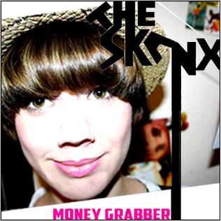
Front panel

This is my final front panel.The font I created was inspired by the generic font used in ska print productions. I made the font myself and was influced by the typography of the band 'The Beat'. The font is anglia and zany, reflective of the genre, with also some reflection of punk influence. The photograph I used for my digipak is a photo of the lead singer (actor) by using a photo of the lead singer it's promotes the band, and is appealing to the target audience. She is wearing generic ska costume - trilby, braces, this is again appealing to the target audience, and genric of the genere. The model is looking directly at the camera, looking staright at the target audience, which would be very eyecatching to a potential buyer. I edited the photo in photoshop, to brighten the image, and make it really stand out, eyecatching. I also enhanced the colours of the photo, to make it more visually appealing. I did the 'money grabber' in pink, because it stands out and compliments the colour palet of the rest of the print production. This pink theme runs though the digipak.
Back Panel

The back panel also features the lead singer. The e.p tracks are on post it notes on her t-shirt, I thought this was fun, quirky and creative way of displaying the track names. Again the costume is generic - trilby, braces, badges anf thus appealing to the target audience and reflective of the genre. I think the image is very strong, the models eyes are looking directly at the camera, drawing the target audiences attention. I called the record label 'Madhouse records' partly random, but influenced by the combonation of the band 'Madness' and on of their tracks 'Our House'.
Inside Panel

The inside panel features various images of the band, thus promoting the band. All the band members are wearing generic ska clothes - trilbys, braces, badges, polo shirts, sunglasses, all appealing to the target audience. I edited the photos to black and white, this is a generic image of ska, along with the black and white checker. To carry on the pink element running though my digipak I filled in some shapes of the graffiti in pink and Jack's tie. I think by running this pink thoughout the digipak it makes each panel stand out, people's eyes are drawn to the neon pink. The pink could also be said to delve into 70's punk influences.


Revisions

 Back panel
I've added the website and copyright info to the back of the c.d after looking at over examples of digipaks most of them had this info so I decided to add it to.

Under cd panel
I decided I did'nt like the pink effect of the checkered socks, so I turned them back to the background colour. I then added a smudged effect to the boots to make them look more grunge and as if they are graffiti stencils.


Ad
I made the band website pink so it stands out more and continues the pink theme. I also took the money out because I think it made the compostion too crowded.